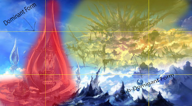
The first bit of work on concept art, Concept art breakdown of the devices used on the picture, such as: Dominant form, sub-dominant form and rule of thirds, the dominant form is usually the most largest thing in the image and in this image is the building highlighted in red, the sub-dominant form are used to balance out the dominant form and are generally smaller then the dominant form.
This was our experiment art work to give us a taste of concept art and to see what its like, we used the golden spiral and rule of thirds to construct these quick pieces.
The rule of thirds is a guideline that helps compose drawings/paintings and allowing other features to flow in the picture.
The Golden spiral is used to guide our eye to the point where we want the viewers eye to go and is a maths ratio in art, the golden ratio is a special number found by dividing a line into two parts so that the longer part divided by the smaller part is also equal to the whole length divided by the longer part.
Syd Mead
1.) The picture by Syd Mead shows the
sublime really well because it shows darkness a lot around the bottom of the
picture and as your eyes look up it begins to get brighter and it obscures our
judgement by not knowing how far this city goes because of the vastness of the
landscape so all this shows that the landscape gives people an experience that
no one will ever get because, its futuristic and looks like a city that spans
across a whole continent.
2.) The purpose of the sublime is to make the audience immersed
in the painting and to give us that feeling of fear physically but still
knowing your safe so it gives you pleasure this is used in concept art because it
makes the players/audience immersed in the painting.
-------------------------------------------------------------------------------------------------------------------------------
Colour Theory
Colour Theory is guidance to colour mixing where you have Saturation and Value
Saturation is the intensity of the colour itself.
Value is the brightness/darkness of the colour.
Colours are applied to temperature, warm colours like Red, Orange and Yellow remind us of the sun or fire and cooler colours like Blue, green and purple.
Colour can be used to do a lot of things like to tell a story, bright and high saturated colours tell happiness and desaturated colours and monotone colours show sadness.
With the colour wheel, it has "Systems"
Monochromatic- is just using one colour but going through all the saturation's and values of the colour.
Analogous colour- is using colours that are next to each other on the colour wheel.
Complimentary- is using colours that are opposite to them.
Triadic- is 3 colours equally apart from each other.
Split Complementary- is where you take one opposite colour and splitting it.
Double Complimentary- is exactly like complimentary but using two pairs of complimentary.
Colour Wheel
Concept art piece:
This was the start of my concept and my idea was to have a eye of fire as the vocal point, to do this i used a blob of orange for the outer fire of the eye and messed around with the outer glow to make it more immersive for the viewer.
In this one i changed the position of my vocal point and horizon line to the middle and added a murky background colour for the eye of fire to stand out more.
Here i added clouds to show that the perspective is worm view (that is looking up) and to give the piece some depth.
At first i wanted this to be a road but it made more sense to change it to a building and my goal is to make the building reflect the glow from the eye of fire.
In this phase i added some darker clouds with the light from the eye shining through the clouds, i used a mixture of black and grey for these clouds (i kept going over each colour, first white then black and kept going like that) and have the bright orange beam through.
Here is the image without the rain.
Here is the image with the rain, i used a large bristle brush on a low opacity to have the rain slightly visible but enough to block out some rays of light.
Here i added a vibrance filter and change the saturation and the vibrance settings to change the all round colour of the eye and the flames to a red and have a yellow glow on the building like a reflection off the glass.
This is my final experiment and my dominant form is the silhouette and the sub-dominant is the building, i used light to lure the viewers eye to each point of my piece, i mainly used darker colours to get the sublime involved in my piece and make the viewer seem small but safe and it gives the effect of destruction and warmth so it looks like theirs a fire, the problems i encountered doing this were trying to make it blend, i used an arrange of tools to do this, the smudge tool was a big help to do this as well as a normal soft brush on low opacity and low flow to make slight changes on the borders of colour.
----------------------------------------------------------------------------------------------
German Expressionism.
Whatever happened to baby-Jane:
This was a Film Noir film that used Black and white, high contrast and use of emotions such as isolation because Jane was a child star while her sister was not famous like Jane as well as Jane's sister was ignored by her father, once they grew up Jane was still treated as if she still was younger, this means that the emotions of isolation was brought into play.
Kathe Kollwitz, Memorial for Karl Liebknecht (1919)
This piece is a "wood cut" where they get a block of wood and cut into it to make a German expressionism piece but this a "print" piece, she did this to show us the horrors of poverty and what it does to people.
Paul Leni: Waxworks (1924)
This is "Waxworks" a German silent fantasy-horror film where a young nameless poet goes too a wax museum to write a back story for each wax model, in order to draw attention to the museum.
Dr Jekyll and Mr Hyde (1931)
The film of Dr Jekyll and Mr Hyde tells a story of an English doctor called Dr Henry Jekyll who believes in each man lurks impulses of good and bad.
German Expressionism
This is the mood board of ideas i like in German Expressionism.
Here are my experiments for German expressionism.
These are two experiments that i would like to add to my piece.
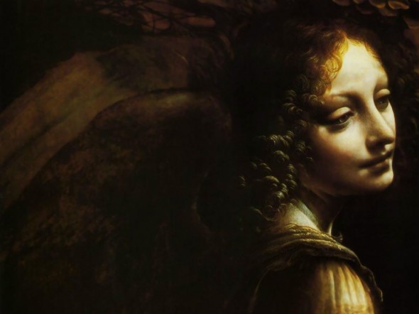
Leonardo Da Vinci
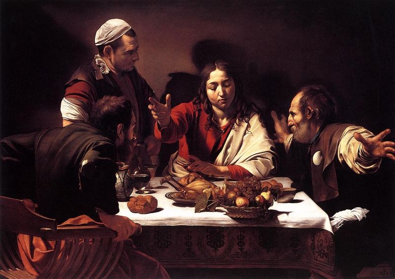
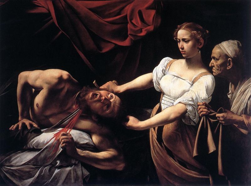
Caravaggio
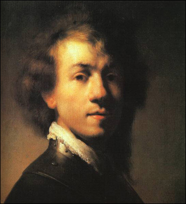
Rembrandt

This is another experiment for my German expressionism.
I used the fill tool and placed black on the buildings and under the spikes to make the buildings show off a bit.
This is another experiment, i took out the black and added a slight variant of grey on the buildings to give some interest to them.
This is one of my experimental pieces for German expressionism to give me ideas for my final piece for this project, i want a this sort of design for my final piece to have the buildings refract through the bubbles.
This is a quick German expressionism piece to get more ideas for my final piece, in this experiment i only used 3 lines and a dot and the tools i used are the twirl tool and outer glow for the eye in the middle.
-------------------------------------------------------------------------------------------------------------------------------
We went into the studio and did some light experiments.
-------------------------------------------------------------------------------------------------------------------------------
Final Piece.
In my final piece i decided to do a dream vortex that will draw in the viewer.
To start it off i used a black background to make the shapes stick out even more.
I added three buildings and refracted them threw the bubbles to displace the shape.
I used this picture as a reference to get the direction of the refracted buildings.
And here i added the spiral to give the vortex feel to the piece, personally i feel like i am being taken
away, it makes you wonder what lurks in the dark void.
I used this as a reference image to my final piece to add light reflections to my bubbles to make them more interesting to the viewer, makes them think where the light is coming from.
Here i added two plants at the sides to make it more like a dream also i added a raptor in mist, in the middle to get the viewer interested and take a second glance at its wavy vortex, the focal point is in the middle of the spiral because when i was first making this i was thinking of just keeping the bubbles but then i started adding some other patterns to it, the dominant form is in the centre because it is the most contrasted and draws the viewers eye, my favourite part about my work is the bubbles refracting the buildings, the only colours i used were white and grey all on a black background.
Here is my German expressionism character, i used the same technique as the main piece, i did encounter one problem while doing this, i wanted to define the head a bit more, to do this i drew a line and twirled it to make one side but i kept trying to make it more like mouth and eyes, when i achieved this i duplicated it to have the other side and combined them together.
i added an outer glow on the fire inside his face to make it glow on the black background like he would stick out in the void.
-------------------------------------------------------------------------------------------------------------------------------
Evaluation
I got my idea for my German expressionism from looking at other artists such as Leonardo da vinci, by doing this i made a moodboard and made an experiment German expressionism piece to help me find what my final piece will be.
While i was doing my German expressionism project my favourite part was the distorted perspectives and the slim list of colours (White,Grey and Black) mainly because of the weird and wonderful things i could of done with them as well as to try new design ideas that i could not really do within the concept art project, another part i really liked about the German expressionism aspect was what i could do with the lights.
At the start of my final German expressionism piece i put a black background and started using a normal white on the pencil brush and made some bubbles, once i did that i added a light reflection on the rim of the bubbles after that i added a grey to make it cloudy underneath the bubbles and a grey spiral to make a spinning vortex in the middle of the piece, while i was making my final piece the only colour i used was a white and grey.
I only used light on the bubbles to give them more depth, like a mysterious light from underneath them around the outer rim of them, this makes the viewer wonder where the light is and what it is, on the other hand it was fairly difficult to get it to how i got it, to do it i added a bit of white and a light grey coat over it and bevelled it first and after that i added an outer glow to make the light shine a little bit through the black background, using the background it makes the light stick out more then normal.
Out of all the artists work i looked at Rembrandt work is the one i took the most influence from because the colour scheme is simple but impacting and effective, so i wanted to use a simple colour scheme but to make it mysterious.
I have used a lot of the twirl tool to make really dynamic shapes and designs, i can use other tools to distort my pieces also i have used outer and inner glows in my work to make interesting lighting in my piece, these two helped me develop my final piece by adding more detail and effects to give it more depth and make it more interesting.
If i could change one thing for my German expressionism piece, it would be to make it more distorted as well as to add a tiny bit more cloud behind the bubbles.
If i could turn my final piece into a game, the idea would be that each distorted bubble would be a different universe where historical events would have the opposite effect, like distorted futures to our main one, if it was to a concept art, i would add visions to the bubbles of the different historical events.


No comments:
Post a Comment